Aesthetic Notion Templates That Last Past Week Two (Matched to the Life You Plan)
Aesthetic Notion template picks matched to the life you plan: five setups compared, a week-three test, and what a pretty page needs to survive real use.
By Her's Notion Planner by Cosmo Suite · Editorial policy
Published · 10 min read
You found a Notion template that looked dreamy in the preview, duplicated it, added three entries, and by week two had stopped opening it altogether. Sound familiar?
It usually comes down to one of three causes. The page looked polished while empty and became cluttered once full. Or it covered only one corner of your life, so you kept a second and third setup elsewhere. Or it never appeared where you genuinely plan, which is your phone.
All three are fixable, and none of them is a question of taste. This guide explains what an aesthetic Notion template needs in order to still look good in week three, and how to match its appearance to the life you plan.
In a Nutshell:
- An aesthetic Notion template earns its place when it looks good full, not just empty.
- Five setups cover most needs, from a single tracker to one connected home page.
- Run the four-point week-three test before you duplicate anything.
- Pick the palette first, then the layout, then add entries.
A Pretty Template Has to Survive Real Entries
An aesthetic Notion template is a pre-built page with a matching palette, covers, icons and layout that you duplicate into your own workspace and fill with your own plans.
The preview is the easy part, because creators style an empty page with a clean cover and soft colours, and an empty page always looks calm. Your own page won't stay empty for long: by week three it holds a missed habit, a half-finished goal and a bill that's due on Friday.
So judge a template the way you'd judge a sofa: sit on it. Ask what it looks like with 30 entries, and what happens on a Monday when you come back after a busy week. The screenshot is a starting point, and the sofa test is the verdict.
[Unique insight] Do the arithmetic on one tracker. Five habits across seven days is 35 tick boxes a week, so 105 by the end of week three. A layout that looks airy at 0 ticks has to hold 105 without a rebuild, and that is where most previews stop being useful.
Notion's template gallery lists many free, well-made pages, and it's a good place to start looking. The question is which of them still look finished once your life is in them.
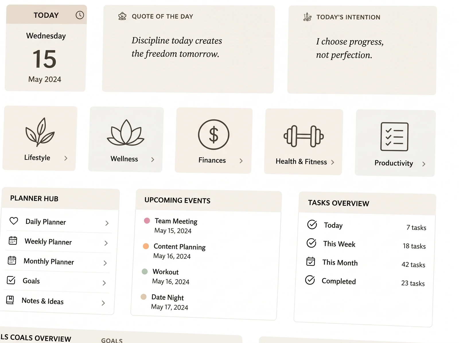
Five Aesthetic Notion Setups at a Glance
Most aesthetic templates fall into one of five setups, and the right choice depends on how much of your life you want to keep in a single place.
| Setup | What it looks like | Best for | Week-three risk |
|---|---|---|---|
| Cover-and-icon gallery page | A styled index of linked pages | Browsing and mood | Pretty links to pages that stay empty |
| Single tracker | One page for habits, mood or money | One clear job | You end up with five unrelated trackers |
| Home dashboard | One page of widgets and quick links | Seeing today at a glance | It needs a rebuild whenever your routine shifts |
| Connected hubs | Several linked pages by life area | A whole life in one place | More to set up, unless it comes finished |
| Minimal paper look | Black, white and plenty of space | People who like a notebook feel | Plain pages can feel flat on a busy day |
A single tracker is the fastest start and the easiest to quit, because it only answers one question. Connected hubs take longer to design, but they answer the question you ask every Sunday: how is my whole week going?
If you only need one thing, a free single tracker may be all you need. If you've abandoned two or three of those already, the pattern points at the setup, not at you.
Run the Week-Three Test Before You Duplicate Anything
A week-three test is a short checklist you run on a template's listing page, before you pay or duplicate, to predict whether you'll still open it after two weeks. Four checks tell you more than any preview image.
Does it show real entries? Look for screenshots with data in them, such as filled checkboxes, amounts and goal progress. An empty preview hides how the layout copes.
Is there one home page? If you have to hunt through ten separate pages to find today's plan, you probably won't keep doing it, so one page should link to everything else.
Does it work on your phone? Most check-ins happen in a queue or on the sofa, so open the demo on your phone, or look for a phone view in the listing.
Does it look right in light and dark? If you plan at night, the dark theme matters as much as the cover.
None of these checks is about colour. Colour is the easy part to change later, whereas structure is the part you live with every single day.
[Original data] We scored the five setups from the table above against these four checks, giving one point for each check the setup usually passes. This is our own rubric and judgment, not a survey of templates, and the method is simple: one point per check passed, half a point where it depends on how the creator built it.
| Setup | Real entries shown | One home page | Phone-friendly | Light and dark | Score out of 4 |
|---|---|---|---|---|---|
| Cover-and-icon gallery page | Rarely | Yes | Sometimes | Sometimes | 1.5 |
| Single tracker | Often | No | Sometimes | Sometimes | 1.5 |
| Home dashboard | Sometimes | Yes | Sometimes | Sometimes | 2.5 |
| Connected hubs | Often | Yes | Sometimes | Sometimes | 3 |
| Minimal paper look | Rarely | Sometimes | Often | Sometimes | 1.5 |
The gap comes from the home page and the real entries. Connected hubs score highest because they pass both, which says structure counts for more than style.
Pick the Palette Before the Layout
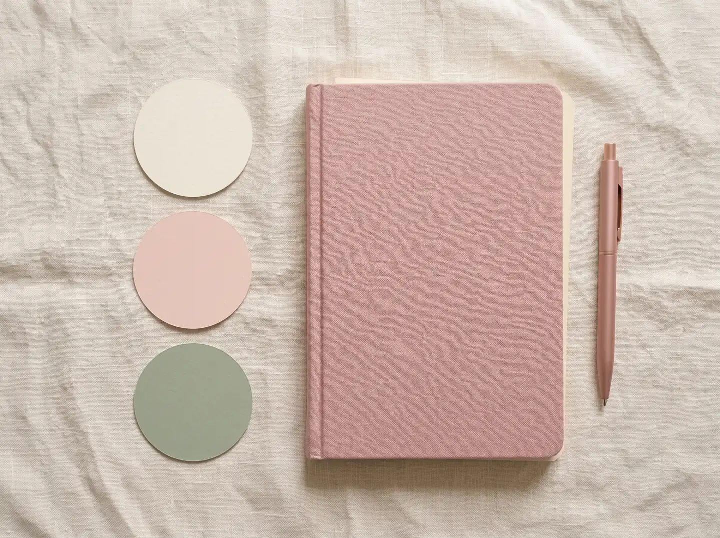
A palette is the small set of colours you reuse on every cover, icon and database so the whole space looks like one piece. Choose it first, because it's the one decision that keeps everything else consistent.
Two or three colours is plenty. Use a soft base such as cream or white, one accent such as blush pink or sage, and one deep colour for text. Notion's help center says cover art appears as a banner at the top of any page, even on databases, and that every page can carry its own icon. Keep covers in the same family, and use one icon style throughout, so the banner and the icon never fight each other.
When a page feels messy, the cause is rarely too many items. It's usually too many colours, with every database wearing its own. Settle the palette once, and a full page still looks calm, because every new entry inherits the same look instead of adding a new one.
A template with its palette already applied saves you that work. A blank one gives you total control, and a lot of decisions to make before your first entry.
Match the Look to the Life You Plan
Think in terms of life areas rather than features, because a good setup gives every area a home that looks consistent with all the others.
Productivity: one calm page for the week
Here you want tasks, projects and a weekly view, with room to breathe. The test is simple: can you see today's three things without scrolling? If you can't, the page is doing too much, and trimming it will help more than any new colour.
Best for: anyone who plans around work, study or home.
Wellness: habits, mood and a daily check-in
A wellness page should be quick to fill in, with a few tick boxes and one line of reflection. If it takes five minutes, you'll probably skip it on exactly the days you need it most.
Best for: routines you want to see building.
Lifestyle: the cosy side
This is where a vision board, a daily routine and the things you enjoy live. It's the most visual area, so it's where the aesthetic matters most.
Best for: anyone who wants the planner to feel like her own space.
Learning: a place for what you're growing into
Notes, courses and resources belong together, not scattered across tabs. Keep it light, so adding a note takes seconds.
Best for: courses, hobbies and personal projects.
Finance: money in the same calm style
Money pages should hold a full month: income, spending and a savings goal. They're the easiest to leave half empty, so check the preview for real numbers.
Best for: one monthly view of income, spending and savings.
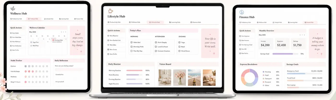
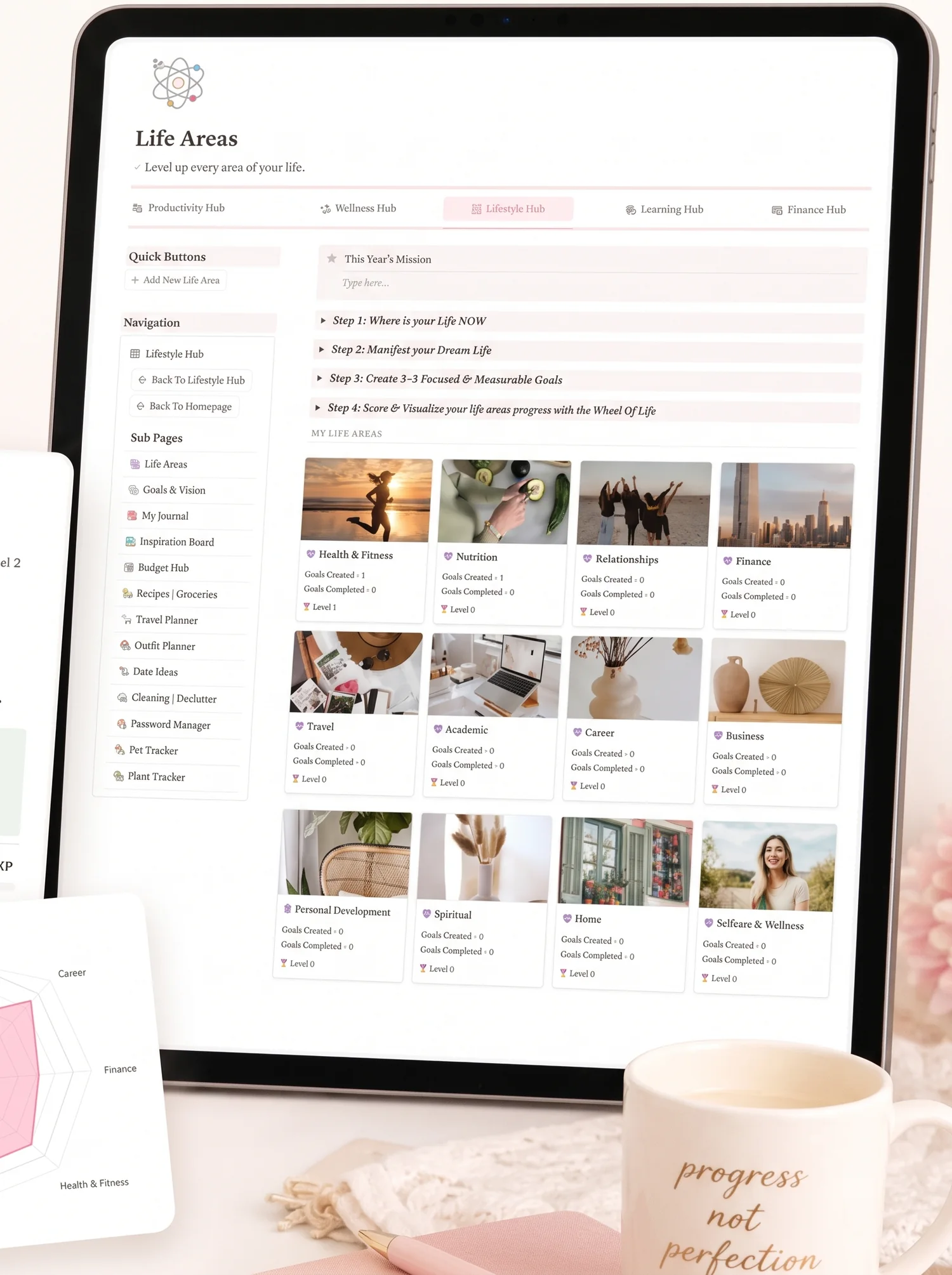
A hub is one linked page that gathers everything for a single area of life, so you open one place instead of five. It works because, per Notion's introduction to databases, databases are collections of pages that can be shown as a table, list, board, calendar or gallery and connected to each other. These five areas are exactly how Her's Notion Planner is organised, as five hubs with the same look on each. That's our product, and we show it as one worked example of connected hubs. You can build your own version of the idea.
A Sunday Reset That Keeps the Page Pretty
Keeping a page tidy takes a routine more than a clever design, and this is the twenty-minute version.
- Make a coffee and open your home page.
- Archive anything finished this week.
- Pick three things for the week ahead.
- Tick your habits and add one line about how the week felt.
- Glance at your goals and your money page, then close it.
Five minutes of that already helps. The point is to open the page on a day you'd rather not, and to find one that doesn't judge you for the gap. Small, repeatable check-ins beat a big monthly clean-up, because a short routine is easy to keep on the days that feel too full for anything else.
If you came back after a busy week, don't catch up on everything. Archive the old tasks and start from today. A planner that survives a missed week is the one you'll still be using in month three.
What Moves a Template From Pretty to Kept
Appearance gets you to duplicate a template, but these four qualities are what persuade you to keep using it.
Open it finished. The biggest drop-off happens during setup, because when you need to design databases before making your first entry, many people simply stop at that point. A Notion planner that opens already built skips that step, so your first session is planning, not building.
Connect the areas. When your goals, habits and money sit on linked pages, one tick can move a progress bar elsewhere. That small bit of feedback is what pulls you back.
Make it phone-sized. A planner you can check in a queue gets used more than one you have to sit at a desk for.
Keep one routine small. Pick one daily action that takes under two minutes, and anchor it to a time you already have, like your morning coffee.
If you want the whole life in one place without designing it yourself, five connected hubs, goals with a progress score and a phone dashboard are what a finished setup looks like.
Why Trust This Article
The Cosmo Suite team wrote this guide. We also make Her's Notion Planner, so the product section below is our own. Notion's plan details come from Notion's pricing page and its template gallery, both linked in the sources and checked on 5 October 2026. Prices and features change, so verify before you buy. You can read about us and the company behind this site and our editorial policy, or reach us through the contact page. Notion is a trademark of Notion Labs, Inc.; Her's Notion Planner is not affiliated with or endorsed by Notion.
How Her's Notion Planner Fits In
Everything above comes back to one bottleneck. Even a free setup has room to grow: Notion's pricing page lists databases for "hundreds or thousands of items" on the Free plan, so cost is rarely the blocker. Time to build is.
So the bottleneck is this: a template has to be finished before you can use it, and connected before you'll keep using it.
Her's Notion Planner is a Notion template at $9 one-time. It comes as five hubs (Productivity, Wellness, Lifestyle, Learning and Finance), each in the same soft palette. It adds a Second Brain 2.0 with an integrated P.A.R.A system, Life Areas with gamified Goals that show real-time progress, and Life Planners with built-in automation.
Dashboards work on desktop, tablet and phone, in light and dark themes. A setup guide and step-by-step tutorial walk you through your first session, and a Simple Weekly Planner comes as a bonus.
You'd still make it yours by adding your own entries and choosing what to keep. If you want to see how it reads on your own screen, take a look at the full Notion life planner and its screenshots.
Frequently asked questions
What makes a Notion template aesthetic?
A consistent palette, calm spacing, covers and icons that match, and a home page that looks finished. Looks are only half of it. The template should also hold real entries without turning messy, so check how it looks full, not only in the preview.
Are free aesthetic Notion templates good enough?
Often, yes, for one job such as a habit tracker or a reading list. Free templates tend to be single pages, so the cost shows up when you want money, habits and goals on one connected home page. Try a free one first if you only need one tracker.
How much does an aesthetic Notion template cost?
Prices vary by store and by how much the template covers. Check the listing on the day you buy. Her's Notion Planner is $9 one-time, and Notion's own gallery lists templates you can duplicate without paying the creator.
Do I need paid Notion to use an aesthetic template?
Usually no. Notion's pricing page lists databases on the Free plan, and most planners are built from pages and databases. Check the template's own listing for anything it says it requires.
Will an aesthetic Notion template work on my phone?
It depends on how it was built. Wide multi-column layouts can squash on a small screen. Open the template on your phone before you commit, and favour layouts that stack into one column.
How do I keep a Notion planner pretty after weeks of use?
Use one cover style, one icon set and two or three colours, and archive finished items weekly. A short Sunday reset keeps the home page tidy far better than a big monthly clean-up.
